A recent report from Wine.com that correlated high-quality wines with cork closures got me thinking about corks and screw caps. Since April is Earth Month, it’s a good time to explore natural cork closures versus metal screw caps and answer the burning question: which is less harmful to the environment?
Where Do Corks Come From?
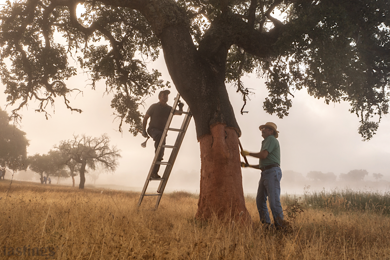
Cork comes from the cork oak and Portugal is home to 34% of them, with another 28% of the world’s cork oaks in neighboring Spain. Growing and harvesting cork is a long-term investment. It takes 25 years for a cork oak to yield its first harvest – and that first harvest nets cork that is not useable for wine or spirit bottles. The earliest that the next harvest can be made: nine years. And that second harvest is still not good enough quality for wine corks. It takes a minimum of 43 years to get the first harvest of cork that can be used for bottle closures!
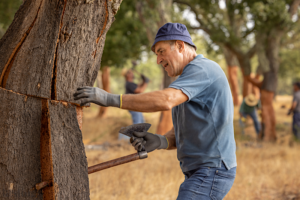
Harvesting cork is not easy. Harvest happens in June, July and August – and in Alentejo, those months are hot, averaging 89°F. Highly skilled and trained harvest workers are paid €150 per day to carefully carve bark from the trees with a very sharp tool, and take great care to not damage the tree.
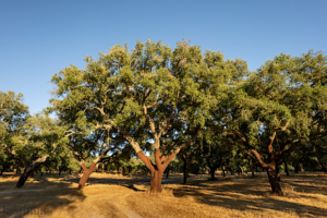
Cork is a Super Sustainable Natural Resource
Cork oaks aren’t irrigated and no pesticides or fertilizers are used, making them low-maintenance. Plus, black pigs eat the acorns that fall from cork oaks, so they are an important part of an entire ecosystem.
On top of it all, cork has a negative carbon footprint. Cork forests are great at carbon sequestration, as the trees absorb carbon from the atmosphere, and they are lightweight in transit. In fact, studies have shown that a single wine cork can offset the entire carbon footprint of the glass bottle in which it is put.
Most consumers associate cork with higher-end wines and year upon year cork closures are the preference for wines that earn the highest scores, regardless of price point. The conclusion cited in a APCOR (Portuguese Cork Association) report that “the best decision a novice consumer can make when choosing wine is to purchase a wine sealed with a cork.”
This begs the question of Australian wines, which are known for being mostly under screwcap. But that may be changing, according to APCOR’s Operational Director, Carlos de Jesus. “For three years in a row – from 2017 – to 2019 – use of cork in Australia grew by 33% each year.”
According to de Jesus this can be attributed to three things: the growth of sparkling wines in Australia (which only use cork closures), the younger generation of winemakers who aren’t interested in making the next “$2.99 screwcap Chardonnay,” and the massive importance of the image-obsessed Chinese market on Australian wines until the tariffs of March 2021.
Some Background on Screwcaps
Screw caps do come from factories, but this makes them low cost and consistent. They are made from aluminum and/or tin and plastic, and the metal components can be recycled indefinitely. Amcor, the company that produces the popular Stelvin brand of screw cap, has pledged to make all their packaging components recyclable by 2025.
While natural cork is recyclable, facilities that recycle corks are few and far between. The good news is that cork is biodegradable, so even in a landfill, corks are fairly harmless. Aluminum and plastic screw caps can be recycled, but obviously are not biodegradable.
Of course there is the ease of use when it comes to a screwcap. Sure there is an elegance to using a wine key and allure of popping a cork at dinner or really anytime when sharing wine with friends. But there are also those days when you are traveling for work, TSA took your corkscrew way, and all you want is a glass of wine at the end of a long day. The simple screwcap is your friend on these occasions, as much as learning to open a wine bottle with the heel of your shoe is an entertaining life hack.
But What About Cork Taint?
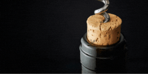
Cork has long been held as the culprit of cork tainted wines. This common wine flaw is in a chemical reaction of fungi, mold, and lignin reacting with fungicides, insecticides, and hypochlorite, aka bleach, which are collectively known as halophenols. The resulting compound, 2,4,6-Trichloroanisole, or TCA, stays on the cork impacting the smell and taste of the wine. In pronounced examples this will make your wine smell like wet cardboard, musty basement, or wet dog. In milder cases this will result in a wine that smells and tastes muted with the typical fruit characteristics just lacking. Either way, you will always notice as corked wine as the off flavors become more pronounced with time and oxygen.
While TCA is not harmful to ingest, those faulty aromas and flavors can ruin a wine experience. So with time and research, the cork industry has invested heavily in finding ways to minimize and even eliminate the presence of TCA in corks. In fact de Jesus, said, “The sweet irony is that as long as cork has been defeated by TCA, it has now become the best defense against TCA.”
He is referring to processes that have been developed to get rid of TCA in corks. These processes can be expensive, but for wineries and winemakers who make “safe” corks a priority, it’s a good investment.
Alex Sokol Blosser, president of Sokol Blosser Winery in Willamette Valley, Oregon, explained why they use the DIAM™ natural corks on their wines. “It’s natural cork that gets ground up into flakes and then goes through a sort of “decaffeinating” process that removes any TCA. Then the cork is then reassembled into one piece with beeswax, so it’s a win-win!” He notes that since Sokol Blosser started using DIAM corks in 2008, they have not had one corked bottle of wine.
Screw caps also can reduce the possibility of TCA, but as de Jesus said, “Cork is not the only carrier of TCA – it can be present in fruits, vegetables, coffee beans, even plastics – and even, sometimes, screw caps.”
Decisions and Choices
In speaking with winemakers, the preference for cork was unanimous, because of the sustainability. “I prefer using corks over screwcaps because cork is a more sustainable product,” said Marisa Taylor, an independent Napa Valley winemaker.
Ana Diogo, director of winemaking at Artesa in Napa Valley agrees. “Cork closures are my preference because they are sustainable and there is more potential for cellar aging for with wines under cork,” said Diogo. “And as a Portuguese, I have a deep appreciation for cork oaks and how they are a protected and important part of the entire ecosystem where they grow.”
Alex Sokol Blosser, declares, “I hate screw caps. Sustainability has a been a core value and daily practice for us since we were founded more than 50 years ago,” he said. “Do I wish that every single bottle we make was under cork? I do. But we also need to sustain our family-owned winery with sales, so a few of our wines are under screwcap to meet customer demands.”
Indeed, according to winemakers that I spoke with, the only reason that some wines are under screwcap is linked to sales. “Servers like screwcap bottles for wines sold by-the-glass,” said Diogo. “It’s a double-edged sword, because screwcaps are more expensive now and some wineries have to bring in a mobile bottling line to do screwcaps – so do the sales make up for the added expense? It’s hard to know.”
In the end, natural cork is the clear winner for the world from an environmental standpoint. As de Jesus says, “The pop of the cork always carries good news. It signals that a great moment is about to happen!”

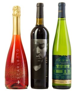 Their Trocken Riesling label’s winning “modern” color combo of lime green foil and navy blue “will stand out and be enticing to buyers,” their “festive” Scarletto bottle’s “elegant” typography “overdelivers for the price point,” and their LVE’s “practically holographic” label “brings the image to life” (with said image being John Legend, who I’m sure most of us would love to share a bottle of wine with).
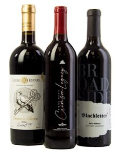 When it comes to a well-executed classic design, the Gecaj Estate 2016 Owner’s Choice has a “good weight” to reflect its quality, the Lescombes Pistol Pete’s Crimson Legacy is “understated” and “classy,” and Broadside‘s 2017 Blackletter Cabernet Sauvignon fully “achieved the rustic vibe.”
 and felt that its “lovely” illustration “evokes the country and vineyard,” which is definitely where we can pretend to be while we sip it. Sometimes you want to try multiple offerings from a producer all at once, and cohesion in design matters!
 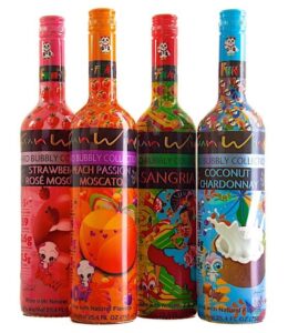 The FUN WINE Hard Bubbly Collection has a “clever exuberant anime design” that’s sure to turn heads, and the Perfect Wines series uses negative space for “simplicity that really works.”
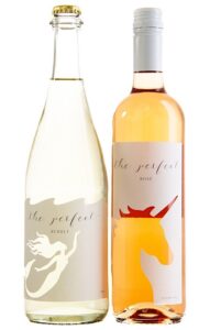
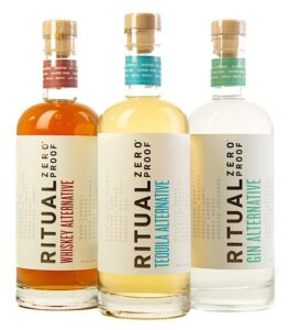 As we continue to improve our at-home cocktail game, we want to reach for pours that still make happy hour feel special. If you’re starting the new year dry, Ritual Zero Proof‘s offerings are “clear and concise” and upon seeing them one of our experts exclaimed “these bottles look GREAT, I would buy them immediately.”
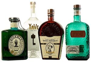 Boukman and Fid Street Hawaiian Gin both have “lovable” and “unique” design, Saint Liberty Bertie’s Bear Gulch has stand-out shape and imprint, and the YaVe Tequila bottle is “durable and functional” and ready to be back in bars as soon as the world is.
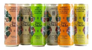 Both Two Chicks Cocktails and Bristow Gin have eye-catching details that will “stand out on the shelf” and Ólafsson Icelandic Gin‘s “inviting, intricate, and unique” label will transport you to a faraway dream.
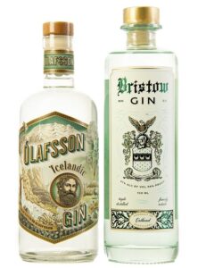


 With “rich concept, illustration, color, print quality, and brand cohesion,” Indeed Brewing’s submissions earned multiple medals for their cans and case, with panelists taking a special liking to their consistent presentation of ingredients and tasting notes.


