While Beverage Testing Institute’s beverage evaluations occur year-round, our highly anticipated packaging competition is held only once annually.
To determine the year’s best packaging submissions, we assemble a diverse group of experts: distributors, buyers, beverage directors, and designers with keen eyes for contemporary form and key insight on what draws consumer attention. Each panelist conducts a solo evaluation, taking time to consider each product individually and independently of any others within a given submission category.
The following design categories are evaluated for each product:
Creativity Fresh and original concepts and execution
Graphic Design Images, text, and arrangement thereof
Form Shape, texture, and mass
Style Relationship of the package elements to the character of the product and its projected image
Functional Innovation Technological, pragmatic, and design breakthroughs
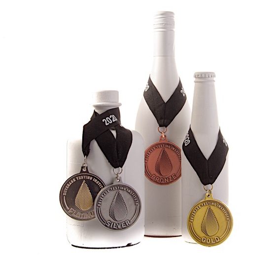
The panelists enter detailed observations and rank entries along a scale for each of these design categories. Once the evaluations have been completed, BTI’s proprietary analysis methodology software aggregates the data and determines the winners of that year’s packaging championships.
And so, without further ado, here are the winners of Beverage Testing Institute’s 2020 Packaging Championships, accompanied by a little in-depth information on why our experts agreed that these products achieved their design goals.
Beer
 With “rich concept, illustration, color, print quality, and brand cohesion,” Indeed Brewing’s submissions earned multiple medals for their cans and case, with panelists taking a special liking to their consistent presentation of ingredients and tasting notes.

Lift Bridge Brewing’s case submission had a winning color scheme and made good use of custom illustration.

“Great artwork” and a “unique approach to design and visuals” showed that Common Cider Company’s can composition was as thought-provoking as it was medal-winning.
Spirits

The “classy appearance” of this glass didn’t disappoint. Panelists found it “lovely to pour into, sniff from, and sip from,” and hopefully the folks at Stölzle are celebrating by swirling a dram in this winner.

These labels were “absolutely exquisite, beautiful, captivating, and rich with story” and our panelists send “high praise for the design team, illustrators, and printer.” Both Barnacles and Espanita would be proud additions to any bar, home or professional.

Newer to the market, Belfour’s covetable decanter-style bottles and attention-grabbing catchphrase, “The Spirit of Champions,” resulted in classy packaging highlighting a brand that “you certainly can’t just walk past on the store shelf.”

Already one of BTI’s high-scoring spirits, Uncle Nearest Tennessee Whiskey has quality packaging to match. “It strikes all the right notes to keep it competitive within its class” and the “small touches” show that “this is a more premium product.”

“Baseball fans rejoice: there’s a whiskey gift for you.” Cooperstown Distillery’s “incredible” bottle and “clever” details came together nicely in this winner.

“Classy, well-crafted, incredible label work” created intricate continuity in Koval’s bottle series, leading panelists to infer that “what’s inside will also be thoughtfully crafted.”
Wine

Jam Jar’s “lovely little 4-pack” had great pattern integration and fun design.

A range of thoughtful methods resulted in these wine label winners. VARA’s “gorgeous presentation” invited panelists to take a “deeper, longer look at this package’s lovely understated crisp presentation” and Bella Luna’s rich embossing established an “elegant and classic” brand identity. Creating personal connections in their designs, Greetings from the Willamette Valley’s art direction did a good job of “evoking memories while encouraging the consumer to make some new ones” and St. Hilaire Cellars’ use of hyper-localized labels was a “powerful tool” invoking a “sense of belonging.”